
Is this my Youniverse, or is this Your Own Universe instead?
UX/UI Design · Figma, Adobe Illustrator
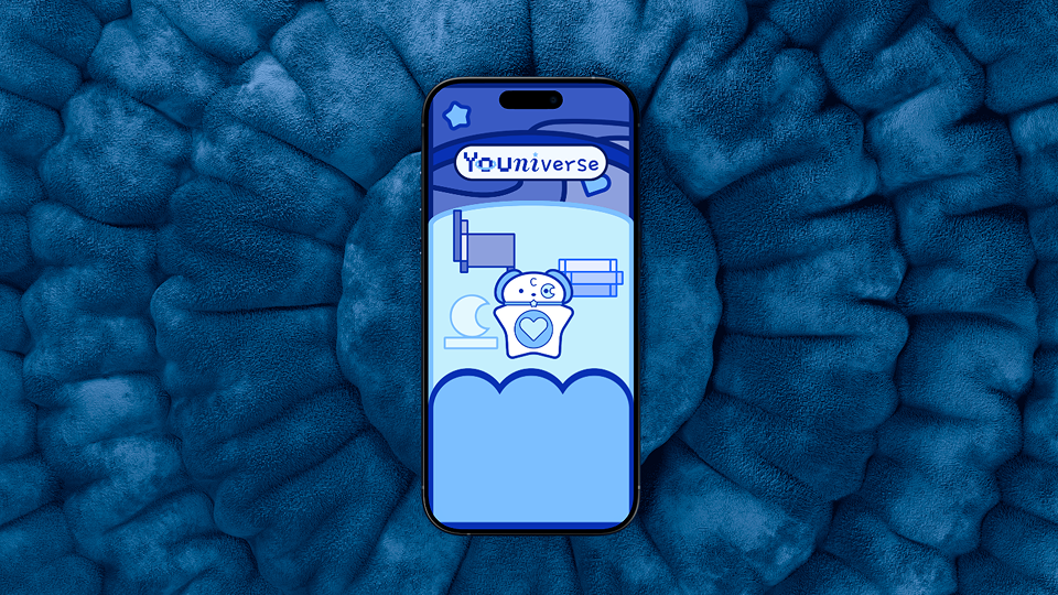
Introduction
Youniverse was supposed to be a project where I would make something for myself, to serve my needs. However, somehow this got lost along the way and by the end of this project, I was questioning whether this was my Youniverse, or your own universe instead and in the end having to learn it is okay that not everything is fit for every user with personal taste mattering in some projects like this one.
Project Brief
For this project, I was tasked to make some sort of educational interactive design product. This was meant to be a piece in our portfolios that would be something that would stand out hence why the recommended option for this project was to make an interactive PDF. However due to my different circumstances in relation to the course this project was taking place in as well as other courses, the best course of action for me was to make an app. Now as my program had a major focus in UX/UI design for apps and websites I was planning on making an interactive children's book at first. Since this could not happen though I was determined to keep this project fun and playful in another way.
Ideation
Youniverse started out due to issues I was having with productivity and task tracking but could not find a system that would work for me to be able to stay productive but also not forget about my other dreams and be able to work on them too, even if the progress was small. This is where the start of Youniverse came to be: create a system where I would be able to productively work towards my dreams while making sure to stay motivated, keep things bite-sized and fun while learning about productivity. The button below will take you to the full Ideation Document of Youniverse.
Ideation DocumentContent Inventory and Storyboard
As these were projects that were either done alone or with one other partner and were done on top of our other coursework in this program, we were expected to time manage efficiently and effectively. Based on our preferences we could either do the Content Inventory and Storyboard (which since this was an app is basically a user flow) separate or do them as one deliverable. I chose to do them as one deliverable so I would get a better idea of the scale of my project as I was doing this alone.
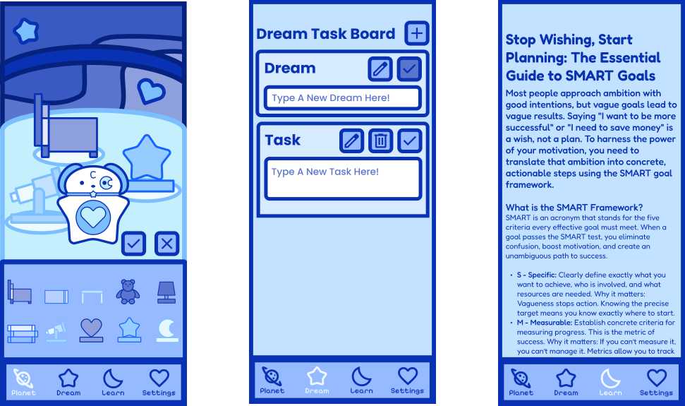
Below is a simplified version of the Content Inventory and Storyboard Document that showcases the key features of Youniverse and how they work together. The user would open Youniverse and then be prompted to sign up or log in with a Youniverse account. They would then be met with the Planet Interface where the Decorate Mode and Motivational Message Feature could be activated. In the navigation bar, the user would then be able to access the Dream Task Board, Article Library, and Settings Menu (which is also where a user would log out). Each part of the storyboard would be followed by a list of content needed if applicable hence why this is both a Content Inventory and Storyboard Document for Youniverse. The button below the Simplified Youniverse Content Inventory and Storyboard Document will take you to the full expanded version of the Youniverse Content Inventory and Storyboard Document.
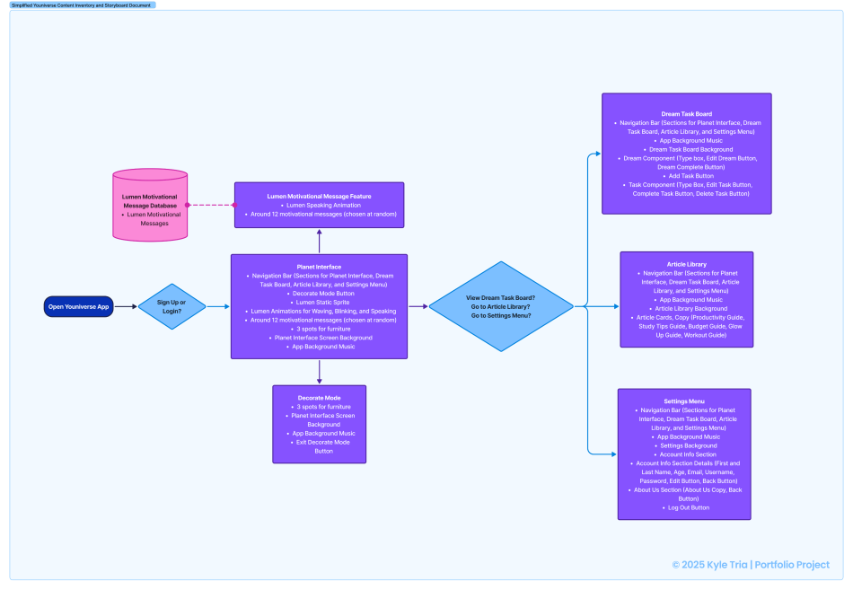 User Flow and Content Inventory
Style Guide
Youniverse was required to have a style guide document. The style guide featured sections on the colour scheme, typography, and various visual elements ranging from a logo, to wordmarks, and various other vector graphics. The last step before I would start my prototyping process for the Youniverse project but to complete the style guide would mean I would need to make most if not all of my visual assets before my style guide could be complete. All of the visual assets would be made using Adobe Illustrator. The following couple of sections are a few excerpts from the finalized Youniverse style guide and the button below will take you to the Youniverse Style Guide Document.
Style Guide DocumentColour Scheme
The branding colour scheme of Youniverse is meant to be calming and dreamy all while fitting a space-aesthetic app. These colours are used in branding and the user interface and may be lightened and darkened from these base versions in ways that see fit and are for the visual experience of the brand. If this were a real app though, this set of colours would only be the default theme as the user would able to choose from a few different monochromatic colour schemes and colour blind friendly pallets to add personalization and for an accessible user experience.
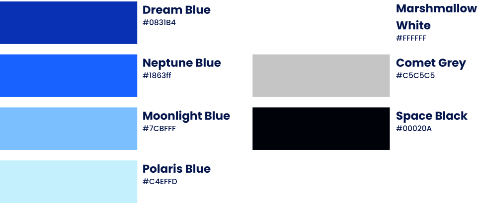
Typography
The typography for Youniverse features three fonts: Poppins, Fredoka and Pixelify Sans. Each of the three fonts were chosen for different purposes of the app. Poppins was for the main app interface and components, Fredoka was for the educational bite-sized articles in the "Learn" section of the app (the project was required to have an educational portion or be a project that taught or guided the user), and Pixelify Sans was for the accents of the app such as the navigation bar. Each of the fonts were chosen to give the app a modern yet dreamy and space-like feel.
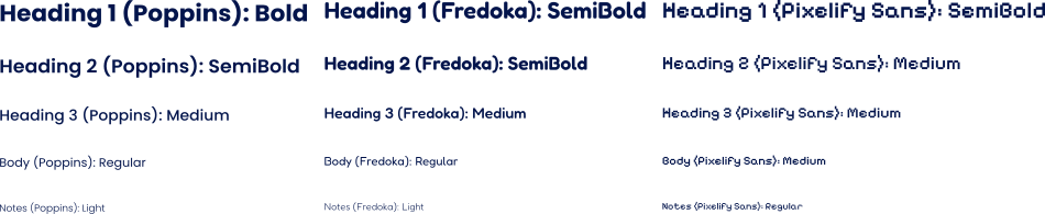
Visual Assets
The wordmark for Youniverse has three main fonts. The first section uses Pixelify Sans with a font weight of semi bold and with the letter o styled to look like a planet. The second section uses the font Playfair with a font weight of bold and is italicized. The letter i also has the dot styled to be a star instead for visual interest. The third and final section uses the font Gamja Flower. The wordmark also has a separate meaning from the name Youniverse (Your own universe) based on how the three sections are created from the different font usages: “You” (the first section) “and I” (the second section) “create a space” (the third section) showcasing how users make a space where they work towards realizing their dreams productively.

The mascot of Youniverse is Lumen (Latin for the word Light), and is a puppy who gives motivation towards the user while they work to realize their dreams. He was included in the app not only for a more distinct brand to the project but to also give the user motivation as if a user were to tap him, a random motivational message would pop up. This was to make the user feel less lonely on the road towards their dreams as if they at least had someone who believed in them, they would be less likely to give up.
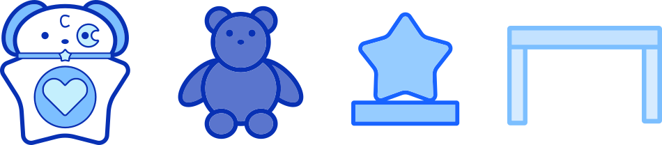
The various furniture items in Youniverse are earned by completing the tutorial, reading productivity articles, and realizing dreams. Completing the tutorial and reading productivity articles earns basic furniture items the user can place on their planet while realizing dreams earns the user trophies that can be placed instead. Each item is done in a similar style with a solid fill and a thick stroke to outline with a monochromatic colour scheme. This was done to match the Youniverse visual style as a whole as going for a more simple and playful style was intentional to give the app a welcoming feel for users so they feel invited to use Youniverse to stay productive and realize their dreams.
Prototyping
The final prototype for Youniverse was made using Figma and was the step that followed after creating the style guide. As I was someone who struggled a lot with using Figma this project taught me a lot about what Figma is capable of and how to properly use components and variables within Figma. The prototype of Youniverse went through multiple iterations before the one that was eventually submitted for the project was finalized. The prototyping stage had helped me realize the various issues that were present in the design early drafts of Youniverse and had helped me improve my Figma skills considerably.
Youniverse or Your Own Universe?
By midway through this project I was beginning to have some a major worry: "Would other users like Youniverse?". Most likely a combination of stress and the beginning of a creative burnout had caused my mental track to act like this was not a project that was supposed to be personal and instead a product meant to gain a variety of users and be used by a variety of users. Take for example the colour scheme of Youniverse. Initially, I was always planning on having the colour scheme be a set of monochromatic blues with white as an accent but as I had gotten wrapped up in the idea that "Youniverse is not for me" I edited the colour scheme adding a violet and pink to the mix instead.

The purpose of doing so was to make sure Youniverse did not feel "gendered" in a traditional way since blue is a colour more associated with masculinity so by adding more traditionally feminine associated colours like violet and pink, that would help make the app feel more welcoming for everyone (as if pairing an all blue color scheme with a cute art style was not enough for me). I was also concerned about accessibility as having a monochromatic colour scheme does not make it easy for colour blind users to use so I thought adding more colours would help make Youniverse more accessible (though in hindsight, looking at the other colour scheme now makes me realize that multiple colour blind colour schemes would need to be implemented for this app to be accessible). But the creative burnout I was having at the time was really showing as I just couldn't make that colour scheme work while the monochromatic one that was used in the final version came easily which had frustrated me and stressed me out.
User Personas
The peak of this whole "Youniverse or Your Own Universe" problem came in the form of user personas. I was never required to make user personas for this project yet I made them anyways (if they were required they would have mentioned much earlier in this case study). The thing is user personas are supposed to be based on user research whether primary or secondary information but instead I had based some aspects of these user personas from myself which defeats the point of making a user persona since then I could of just referenced myself. In a way I had been so focused on making Youniverse about anything but me despite wanting this to be something for me that I created documentation that literally showed that: two users based on myself with one being a dreamer and another a doer.
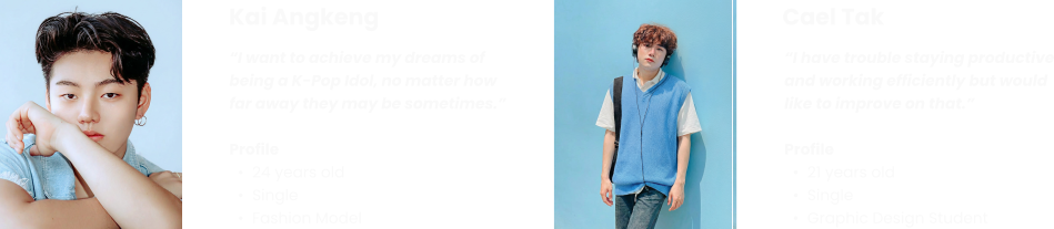
The fact that both the user personas ended up being Asian guys like me did not help as looking back on these it became clear how my confusion on the user of Youniverse was affecting my output now. The button below will show the full "user persona" document I had made for Youniverse and honestly if I had took some extra time that I did not have and found some research to back up these personas and making them more diverse, I would say these would not be so bad if I do say so myself. Fun fact I never ended up really referencing them since they were based on me if anything these two just showcased how divided and unsure I was on the direction I wanted Youniverse to take.
User Personas DocumentThis is my Youniverse
Eventually this whole "Youniverse or Your Own Youniverse" problem had given me such a headache a was accelerating me into a deeper creative burnout that I had stopped working on Youniverse for a while. Not because I needed a break and I knew I needed to take a step back to debrief and regroup but because I was simply unsure of what direction I wanted and felt like I was supposed to take. At that time I was very insecure about my skills and my place in my program so I felt a strong need for Youniverse to be perfect despite me not being anything close to perfect. I was getting anxious when the submission date was getting closer and I knew I needed to start working again but I felt hopeless. In that hopelessness, I simply asked myself "Why was this app called Youniverse?" and then I answered "Because Youniverse was made for me.". At that point everything clicked slowly and as I began to work on Youniverse again I started just doing things for me like changing the colour scheme back to what I had always wanted it to be and in the end learned something bigger.
"You don't need to please everyone all the time as if you can't even please yourself, how can you ever please others."
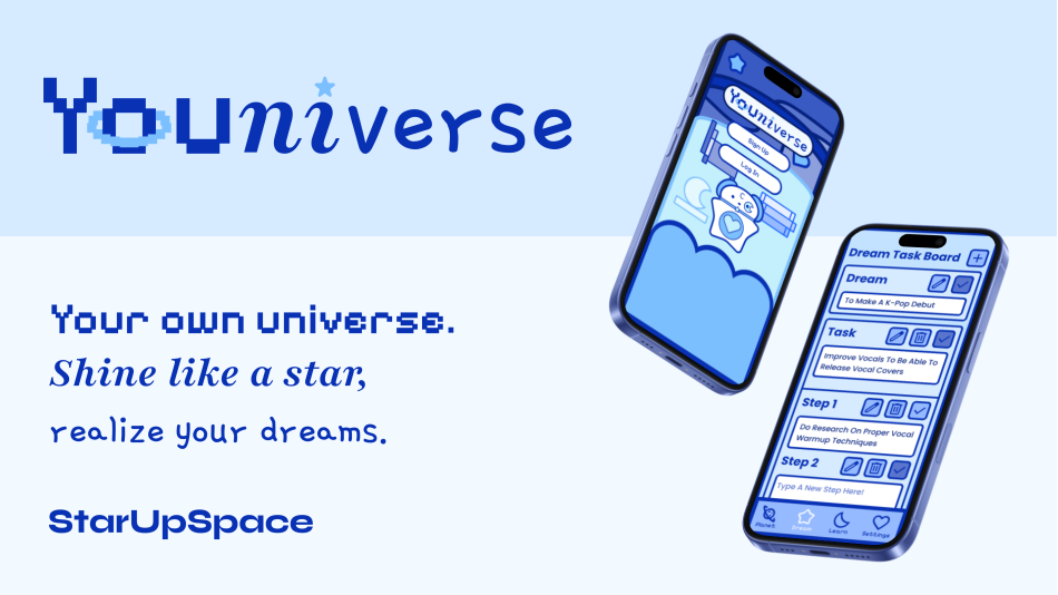
The button below will take you to the view only prototype file of Youniverse which was made with Figma. I hope you enjoy seeing the final product as Youniverse means a lot to me.
Youniverse PrototypeNext Steps
After finishing Youniverse with a renewed mindset I realized how much more potential Youniverse could of had if I had just been given more time or help to complete this project. Some of the ideas I had were different monochromatic and accessible colour schemes users could choose from, multiple mascot characters users could pick and a shop where users could buy other items not earnable though other in game features as a currency system was part of earlier ideas I had for Youniverse. Who knows? Maybe another case study will come for Youniverse showcasing new features I add that were cut initially.
Conclusion
After working on Youniverse for months I realized that my insecurities I had about myself were being output into my work for this project. I felt pressured into perfection and anxious about making anything that someone would say was lackluster. This ate away at me as I was working on Youniverse until I realized how important self confidence is in creative work as if you don't have confidence your brightest ideas will never come to see the light and if you cannot do that, then how are you supposed to build your own universe?