Sunny Side Up
Graphic Design · Adobe InDesign, Adobe Illustrator, Adobe Photoshop
Project Rationale
Sunny Side Up is a fun, brunch themed restaurant with a focus on breakfast dishes and dishes that contain or have a focus on eggs in general. Adobe InDesign was used for the layout of images and text content, while Adobe Illustrator and Adobe Photoshop were used to create both vector and raster content which were required as well to complement our text copy.
Project Brief
For this assignment we were tasked with making a menu layout that would showcase our InDesign knowledge up to that point with a focus on layout, typography and information hierarchy. The goal for this menu would be to output work that showed our abilities to create a cohesive and easily comprehensibly piece of information while adding our own personal twist on that.
Ideation
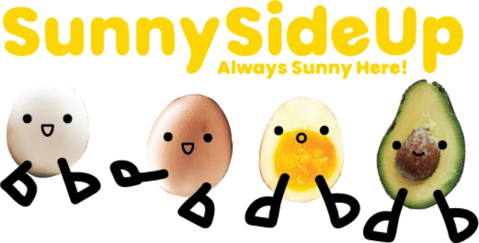
I chose the name "Sunny Side Up" since not only is that a way to cook an egg, but also to have a positive and happy feeling hence why the slogan (which was also required alongside our business name) was "Always Sunny Here!" to reinforce that upbeat and playful feeling I would envision the restaurant (which I pictured to be more like a brunch café) having. The cute various egg and avocado (cause one sliced up does look like an egg and adds a splash of colour and variety) mascots also help elevate this feeling as I would imagine kids also coming with their parents so adding a more childlike element would fit.
Colour Scheme
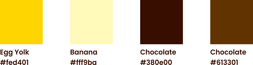
The colour scheme was chosen to reflect the bright and cheerful atmosphere of the restaurant, with yellows, oranges, and browns dominating the palette. Each was given a much more fitting name to be used as the colour watch when being referenced in the Adobe InDesign file.
Typography
The typography chosen for this project was selected to reflect the playful and friendly nature of the brand hence why Poppins was chosen. Each paragraph style for the main typography sections (section head, sub section head, and body copy) were given distinct enough weights and sizes so a clear visual hierarchy could be established. This makes the menu easy to scan and not overwhelming to any guest at Sunny Side Up.

Menu Design
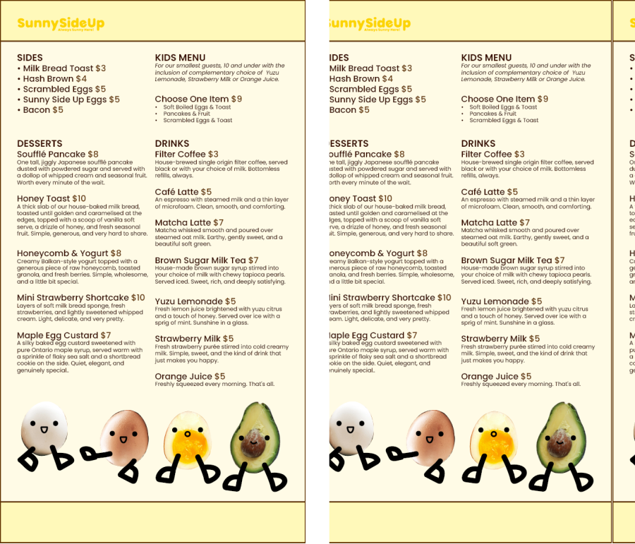
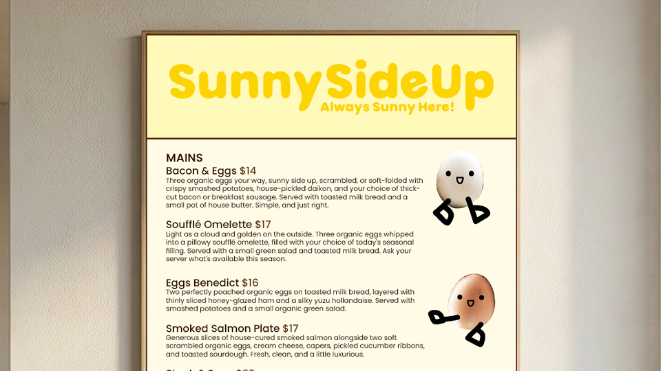
The final menu design was actually majorly adjusted for my portfolio as I changed the copy to be better fitting for the type of establishment I would picture Sunny Side Up to be as the menu become more limited due to being a brunch café rather than a restaurant. The only images now are only of the mascot and not the food itself as for a smaller establishment like Sunny Side Up, having just a single page, double sided menu with the mascots sprinkled across the page rather than adding two more pages just so proper food images could be displayed made more sense. This would be a more effective choice for Sunny Side Up as if their menu changes, most likely so do the food images which would most likely need a professional photographer as well adding up the costs unlike with this setup which requires just an updated menu copy for Sunny Side Up.