Berry Good
Product Design · Adobe Illustrator, Adobe Photoshop
Project Rationale
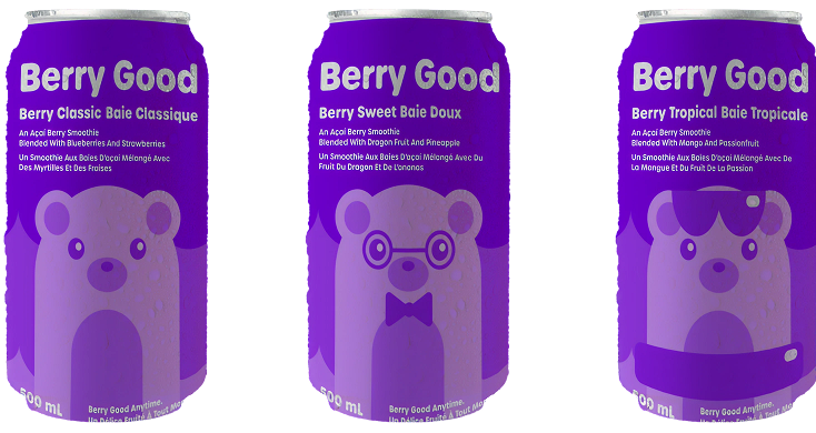
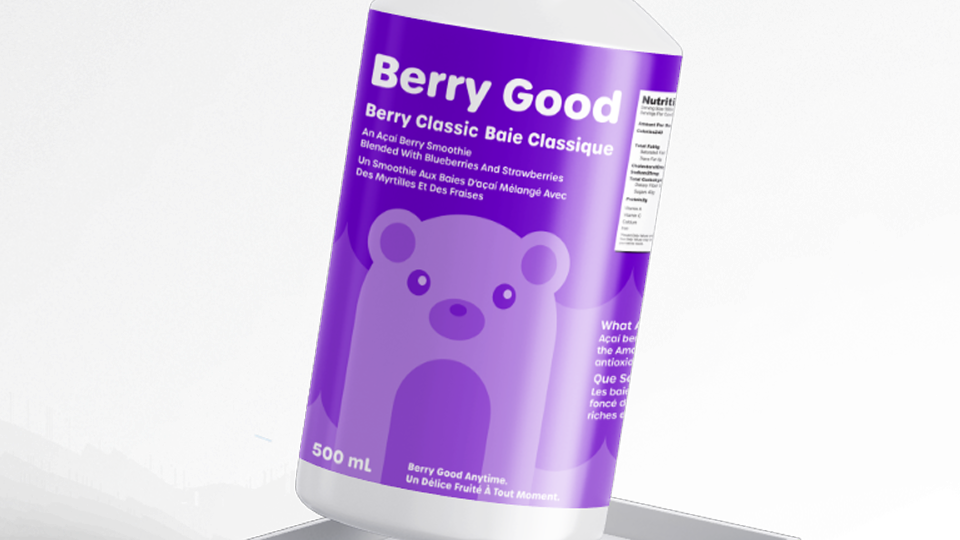
Berry Good is a canned açaí berry smoothie brand with cute and playful twist on a fun drink. Each can has a bear mascot with his own personality to accommodate the smoothie. We had to use Adobe Illustrator to make the packaging for the cans and then use Adobe Photoshop to make some simple mockups.
Project Brief
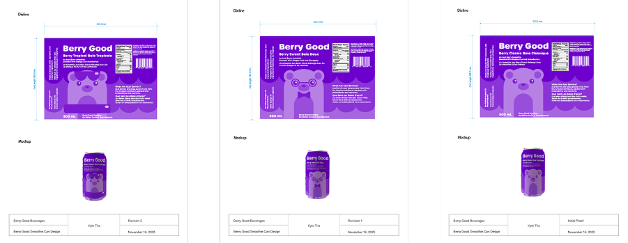
Our tasks for this assignment were split into multiple parts. The first part was to create one can design packaging which included making sure the design would be allowed to be sold in Canada along with a mockup for the can design. The second part was to make two variations of that can design to showcase different flavours while making simple mockups for them to. Each design was required to have a proof along with the design and mockup.
Ideation
For the can design concept I decided to go with açaí berry smoothies as I like açaí berry smoothies a lot and wanted to do something healthy but not a drink that is dairy focused so I landed on an açaí berry smoothie. The bear theme came with that as bears are often associated with berries along with honey and the word bear even sounds like part of the word berry so I thought it must be done. The idea to have each bear be different for each flavour variation was a way to add uniqueness for each flavour variation.
Colour Scheme
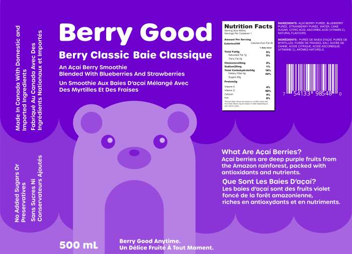
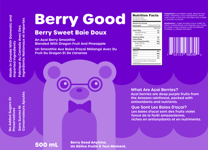
The colour scheme compared to another very violet project known as Milky Way is supposed to be much more vibrant and compared to Milky Way so more vibrant and colourful hues were chosen. Also having a monochromatic violet colour scheme for an açaí berry smoothie is kind of a must as açaí berries are known for their deep purple hues and all their health benefits.
Typography
The font chosen for Berry Good was Urbane Rounded in the bold font weight. I wanted a font that felt soft and playful hence why this was chosen for the project design. The thick lines combined with the curved edges makes the design be friendly which is what you would want for a fun, health drink that even kids would enjoy.
Can Deliverables
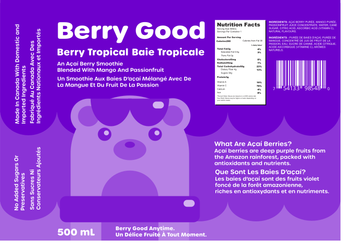
One of the main requirements of the assignment was to make sure that design was eligible to be sold in Canada which means everything would need a French translation. Other things that would be taken into consideration would be that there would need to be a price tag, ingredients list and nutrition facts needed somewhere which means the layout of a can would need a few iterations until a final layout could be achieved. For the regular smoothie there was a plain bear, the sweet one had a smart looking bear and the tropical variation had a bear ready to go into the pool. Each design was followed with their own mockup and proof made in Adobe Photoshop and Adobe Illustrator respectively to showcase how the can would look like.