Milky Way
Graphic Design · Adobe Illustrator, Adobe Photoshop
Project Rationale
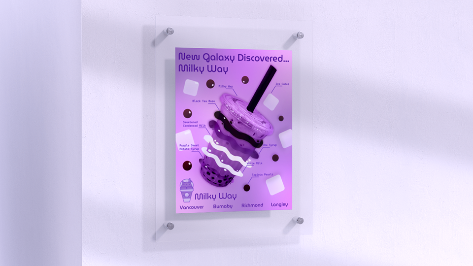
Milky Way is a fictional bubble tea business with a galaxy-motif that also sells baked goods such as cookies and cakes. This project started out by simply making a set of potential logos in Adobe Illustrator and making a colour scheme for the logos using Pantone colour scheme. The step after in this project was to use Adobe Illustrator and place an image that was masked using Adobe Photoshop and make a set of three posters to showcase the brand and business using vector graphics.
Project Brief
This was a design project made to showcase our skills in Adobe Illustrator while requiring some assistance from Adobe Photoshop. The goal of this project was to have three posters of a fictional business that would showcase our knowledge on how to effectively use vector graphics to create media. There would be two parts first would be the creation of a logo and wordmark for the business and then would be the creation of three similar posters.
Ideation
I wanted to do something food based as I thought that would be a fun idea to base a business off as I found ideating around food to be the easiest for me. I also added the space theme as I enjoyed space aesthetics and decided that would make my business unique. In the end, I came up with this business concept: "Milky Way is an exclusive chain of space-themed cafes known for their milk tea that uses flavours and colour combinations to mimic a galaxy. They also sell other menu items with a space-themed motif such as tea, cake and cookies."
Logo
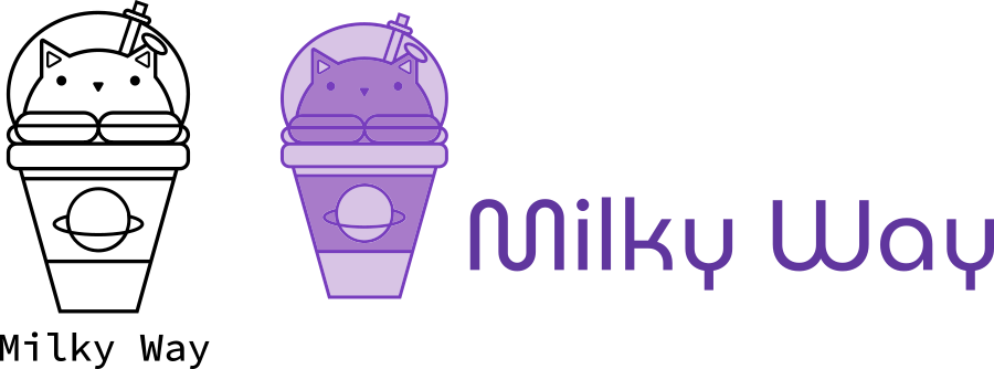
For the logo of Milky Way, I wanted to create a logo that was both playful and modern. I experimented with different ideas to achieve this goal. The final idea I had selected was that of a bubble tea that had three dimensional latte art on top which showed it was a cafe. The latte art itself was that of a cat acting like the mascot for the business. Adding the lid on top of the three dimensional latte art cat created the illusion of an astronaut helmet to go with the space vibe which was elevated with more space motifs.
Colour Scheme
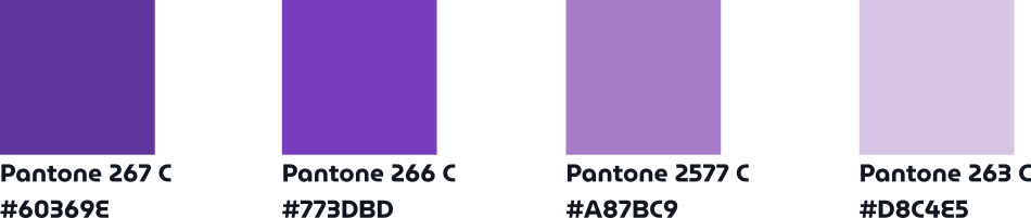
The colour scheme for Milky Way was designed to be soft, inviting, and reminiscent of a dreamy galaxy hence why a monochromatic violet colour scheme was chosen. This was my first time working with Pantone so I was thrown off a bit when realizing there were colour shifts colours that came from hexadecimal digits. Either way the difference between each was subtle and the result still came out spectacular.
Typography
The typography for Milky Way in both variations of the wordmarks and the posters themselves use either MuseoModerno in the font weight medium or Cascadia Code in the font weight SemiBold. These two fonts were chosen to give a space vibe that also had a touch of science fiction to elevate the design and the concept. These fonts would later be used in various ways for the text featured in the poster.

Bubble Tea Posters
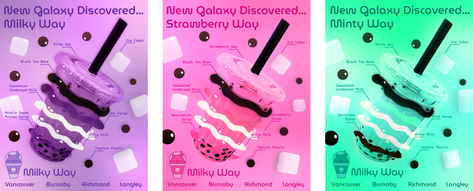
After the creation of the logos, deciding on a colour scheme and coming up with typography, we would use the logo and wordmark we made to create a business poster with two other variations. The first iteration is the one far left which features ube milk tea. I chose ube milk tea since I am Filipino (but I was born and raised in Canada) so I thought that would be a fun touch and also add some uniqueness as most people think of taro when they think of a violet coloured bubble tea at first instead of ube (both are purple root vegetables that can be found in Southeast Asia). The design concept is supposed to be that the bubble tea is a new galaxy being discovered with all the ingredients that make the drink now making the galaxy showcasing how Milky Way makes drinks that are out of this world. The image of the bubble tea was masked out using Adobe Photoshop. When making two other variations I wanted to keep the monochromatic colour scheme so I settled on doing one for a strawberry milk tea and a mint chocolate milk tea to complete my trio of Milky Way promotional posters.